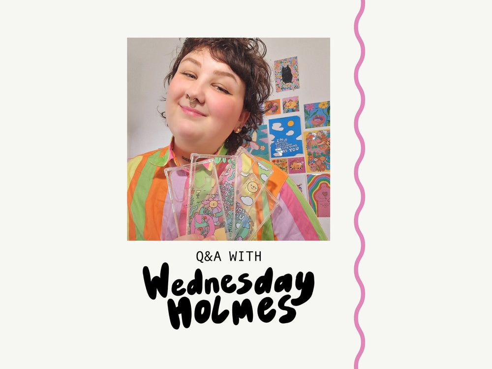
The short description of the article will go here. It will describe where the link leads to.
Frame Styleguide serves as a digital brand guideline to building websites and experiences. The goal of a styleguide is to improve consistency, quality and communication across the UI, making the design and development process more efficient and focused.
This Styleguide is to establish a shared vocabulary between designer and developer, and providing clear, discoverable guidance around design and development best practices.
More information on the importance of Design Systems.
Anyone who is designing or developing a new website using Frame. Even if you don’t need to use these components directly, the base styling and documentation should be a useful reference for how we have done stuff elsewhere and to reduce duplication of work and contaminating the style sheets.
See Getting started on Slite for how to integrate this into your project and how to edit the base styling of your theme.
Color brings a design to life. Color is versatile; it's used to express emotion and tone, as well as place emphasis and create associations.
Custom button styles for actions in forms, dialogs, and more with support for multiple sizes, states, and more.
Examples and usage guidelines for form control styles, layout options, and custom components for creating a wide variety of forms.
The Frame grid system provides a flexible, mobile-first, device-agnostic layout system. It has features to control alignment, order, flow, and gutters.
The grid system is based off materialize.css.
Icons are designed to be simple, modern, friendly, and sometimes quirky. Each icon is reduced to its minimal form, expressing essential characteristics to either replace or accompany labels.
Spacing variables are used to consistently apply margin and padding across components and UIs. Having a set spacing scale brings a rhythm to the product and creates a natural and familiar flow from page to page.
$SPACING_3XS
$SPACING_2XS
$SPACING_XS
$SPACING_S
$SPACING_M
$SPACING_L
$SPACING_XL
$SPACING_2XL
$SPACING_3XL
$SPACING_4XL
$LAYOUT_S
$LAYOUT_M
$LAYOUT_1XL
$LAYOUT_L
Typography is used to create clear hierarchies, useful organizations, and purposeful alignments that guide users through the product and experience. It is the core structure of any well designed interface.
Body 1
Body 2
Lorem ipsum dolor sit amet, consectetur adipiscing elit. Integer posuere erat a ante.
You can use the mark tag to highlight text.
This line of text is meant to be treated as deleted text.
This line of text is meant to be treated as no longer accurate.
This line of text is meant to be treated as an addition to the document.
This line of text will render as underlined
This line of text is meant to be treated as fine print.
This line rendered as bold text.
This line rendered as italicized text.
Accordion enables users to expand and collapse sections of content.
Apples are a fine fruit often associated with good health, and fewer doctor's appointments.
Example. An apple a day keeps the doctor away.
Apples are a fine fruit often associated with good health, and fewer doctor's appointments.
Example. An apple a day keeps the doctor away.
Kiwis are a fun, under-appreciated fruit.
Article cards are a medium-sized component that contains key article information such as a featured thumbnail, title and link.
A component that can wrap any type of content to highlight information for a user or to just draw attention to a specific element.
Indicate the current page’s location within a navigational hierarchy that automatically adds separators via CSS.
A table of the customer's cart contents. Add products from the front-end to enable the preview.
A global banner for stating the site's cookie policies.
A dropdown selector allowing the user to see different prices on the store to the selected currency.
Add dialogs to your site for lightboxes, user notifications, or completely custom content.
Lorem ipsum dolor sit amet, consectetur adipiscing elit. Nulla accumsan, metus ultrices eleifend gravida, nulla nunc varius lectus, nec rutrum justo nibh eu lectus. Ut vulputate semper dui. Fusce erat odio, sollicitudin vel erat vel, interdum mattis neque.
Notifications are messages that communicate information to the user.
Notification title
Notification text goes here.
Notification title
Notification text goes here.
A component that is used to concatenate long sets of data for a user to consume information easier.
The appearance of payment icons help reinforce the feeling of security on the website. These are the currently enabled payment options defined in the store settings.
Product cards are a medium-sized component that contains key product information such as a featured thumbnail, title and price. These products cards are shared across the theme and are one of the most re-usable components available.
The product form is one of the most important components of any e-commerce interface. It is the UI in which users are selecting and clicking around to customise options of the product they will ultimately be adding to their cart.
A small promo banner to appear on the product page, cart page and cart drawer.
Form field to decrement or increment a number input using attached buttons. Each quantity selector has a unique identifier to avoid conflicts.
A group of social media icons with preset links for sharing content.
A highly stylised radio input with the appearance of a selected choice card. There are active, inactive, disabled and empty states for each swatch. Can be used as labels or with filled backgrounds.
The short description of the article will go here. It will describe where the link leads to.
Launching our first phone case design in 2011, it's sure to say that we’ve been on quite the rollercoaster ride since. Co-founders James, Lewis and Richard started Skinnydip shortly after the Apple iPhone launched, quickly realising that fun phone case designs were incredibly limited. They had just the idea that was about to change that forever, and that’s when Skinnydip London was officially born. Since launching, we’ve grown a lot, and quite frankly matured like a fine wine when it comes down to serving up the most fun and quirky accessories, clothing and lifestyle products for all to love and enjoy all year round, no matter where you are.
Being a family-run brand from the get-go, if there’s one thing you can guarantee when working at Skinnydip it’s that we’re all one big family. A working environment that’ll make all your friends and family jealous (i.e. there’s resident dogs and 24/7 snacks), if you like being a part of a close-knit team then you’ve come to the right place.
Things that you can guarantee when working here at Skinnydip is that we don’t take ourselves too seriously, we make sure to have lots of fun and essentially see ourselves as one big family. Being passionate and enjoying what you do is so important to us, because let's face it, getting out from under that duvet every morning is hard enough!
It’s bloody cold outside, you’re slightly rounder than you was pre-Christmas and quite frankly you’re ready for summer 2020 to hurry up and get here already. So to see you through this seriously glum time, we’ve rounded up our best (zero calorie) accessories set to see you through until the warm weather comes back around again. So whether you’re calorie counting or you’ve finally got your ass back to the gym and introduced some greens back into your diet, treat yourself to some fun fruit without the added calories.
We’re inspired by the cool, the kind and the relatable and if there’s one thing we know for sure, it’s that all our products are guaranteed to make you laugh, smile or think ‘damn that’s accurate…’.
Shop New InA global drawer for displaying the cart's content anywhere on the website. The customer can also manage their cart from the cart drawer.
A global drawer for displaying the navigation anywhere on the website, available on mobile.
A good site footer becomes the visual anchor of an e-commerce store in which users are able to see all the key categories and pages at a glance with minimal interaction.